Alibis
retrospective at Tate Modern
Cynicism in relation to materialistic society + ongoing experimentation with materials and processes.
Over the decades (1963 - 2007) the work acquires inner weight and depth. The cynicism becomes relentless probing, the experimentation more extreme. Comes together in The Watchtower series of 1984-88 - the resonances of the image, the use e.g. of continually deteriorating photographic chemicals which mean the painting becomes more and more obscure. Often used toxic and banned substances.
Sfumato series shown in 1990 is a form of writing with light - soot from an oil lantern swirled over glass.
Making canvas translucent with resin.
The Illusionist shown in 2007 is covered with gel raked into ridges which acts as a distorting lens, adding to the confusion and complexity of the images beneath. We are forced to question the nature of what we see both in a material sense and in terms of the subject of the painting; the artist as illusionist.
Why 'Alibis'?
Monday, 20 October 2014
Sunday, 19 October 2014
Malevich
Exhibition at Tate Modern
In the suprematist paintings:
instability - 'toppling' piles of shapes; the eye being forced to shift focus (what is the focus?); counterpooising of shapes; directionality
depth - shape of planes indicates recession; power of colours in relation to one another; white background - infinite; contrasting areas of dynamic; relative size of shapes
The term suprematism refers to an abstract art based upon “the supremacy of pure artistic feeling” rather than on visual depiction of objects. (M's words in italics)
White planes in dissolution, 1917-18 - the dissolution as he thought then of of himself as painter and of painting itself.
Sunday, 12 October 2014
Christopher Wool

Saw a painting of his at ICA's Beware Wet Paint show and responded to the calligraphic like marks and the way they appear to float over the surface. Discovered that his main work involves stencilled text. Works like this painting seem to break free from that.
Anselm Kiefer
Retrospective at Royal Academy
What struck me most was his ability to 'hold it all together' - to have immense complexity playing itself out across a canvas, every square centimetre rich in detail, but all resolved into a working whole.
The power of work in vitrines - the extra depth of field, the focus
Also the use of text:
What struck me most was his ability to 'hold it all together' - to have immense complexity playing itself out across a canvas, every square centimetre rich in detail, but all resolved into a working whole.
The power of work in vitrines - the extra depth of field, the focus
Also the use of text:
- the casual scrawling across a painting of words, usually a line of poetry, but lost on the viewer unless they understand German and are familiar with its literature
- incorporation of text e.g. into the furrows of Black Flakes.
- the image of the lead book (lead the most mutable of the metals)
- in The Rhine the partial obscuring of text, whitewashing, collaging
An interview with Anselm Kiefer, ahead of his Royal Academy show – Financial Times
Inside Anselm Kiefer's astonishing 200-acre art studio – The Guardian
Anselm Kiefer, Royal Academy, preview: Is he our greatest living artist? – The Independent
Wednesday, 2 July 2014
Illumination
The Paintings of Georgia O'Keeffe, Agnes Pelton, Agnes Martin and Florence Miller Pierce
Merrell Publishers Ltd 2009
Karen Moss, Art and Life Illuminated: Georgia O'Keeffe and Agnes Pelton, Agnes Martin and Florence Miller Pierce
The influence of the light and forms of the New Mexico desert environment, which AP discovered in 1921 and GO'K in 1929, then in a later generation, AM and FMP. All were to live a large part of their lives in this and other deserts. They had grown up in different locations and each developed their own artistic vocabulary that fused abstract and spiritual concerns with their connection with the natural environment.
AP and GO'K both born in 1880s, raised in Christian families, went to study art in NY where they came under the influence of Arthur Wesley Dow who taught the first generation of american Modernists and drew on Asian art. AP spent a year studying in Italy and on her return produced work that was a part of the flourishing Symbolist art movement. Both artists in the 1910s were living and exhibiting in NY.
'My first memory is of the brightness of light - light all around.' GO'K
1916-18 she was working in Texas where she produced watercolours full of light - sunrises and starry skies - plus small abstract paintings.
AP moved to rural Long Island in 1920 from where she travelled extensively to Middle East, Greece and Hawaii. Kept journals that included reflections on art and spirituality. Etheric flower studies.
Mid-20s - early 30s both produced landscapes that combine representation and abstraction, often with strong sources of illumination.
AP studied theosophy in which light is a symbol of natural and supernatural phenomena. Painted celestial landscapes in which stars represented enlightenment.
'These pictures are conceptions of light - the essence of fire, not as we see it in the material world, but as the radiance of inner being.'
Also studied Agni Yoga, an offshoot of theosophy and in 1938 joined the Transcendental Painting Group which promoted abstract art.
In 1932 AP had moved to a California desert town where she lived for the next 30 years in relative isolation. GO'K settled in New Mexico. The desert and its light entered their paintings. Right into their late work they fused landscape/nature with inner vision, animated by light.
____________________________
Agnes Martin and Florence Miller Pierce were a generation later, born in the 1910s into Christian families. Both trained in the east but gravitated to Taos.
FMP joined the TPG with Pelton in1938.
AM's early work was abstract but referred to nature. Gradually became purely abstract, geometric. She reduced her vocabulary specifically to express light.
'My paintings have neither object nor space nor line nor anything - no forms. . . They are light, lightness, about merging, about formlessness, breaking down forms.'
Greatly influenced by Ad Reinhardt and his interest in Eastern art and philosophy; had attended DT Suzuki's lectures in NY in 1950s. Often wrote of trying to express a blissful, egoless state in her art.
AP in the late 60s had a happy accident, spilling liquid resin onto aluminium creating a shimmering, luminous effect. Began to work with resin on mirrors to create free-form abstractions, 'lucamorphs' (= light body). Interested in Zen and Tantric Buddhism.
'My works are contemplative. They're about stilling the mind.'
Both working into their 80s, light becoming more and more predominant, works emanating light. Light was the basis of their abstract art rather than form.
For both the desert made possible a particular appreciation of light and also a purer state of consciousness. Light communicates something about the ineffable quality of nature and the mind.
Monday, 16 June 2014
United Visual Artists
Vanishing Point
Exhibition at Towner Gallery, Eastbourne
UVA is a multi-disciplinary collective that combines sculpure, installation, performance and architecture. They reference Alberti, da Vinci and Durer. They experiment with technologies and materials to take themselves in fresh artistic directions, and explore the tension between real and artificially created experiences. The gallery literature says of them: 'A fascination with the physical presence of light is embedded in their work and they explore different ways of creating a structure from light by employing perspective as both a tool and visual outcome to reshape, redefine and represent a space.'
3 works showing in this exhibition of increasing immateriality:
Vanishing Point 3

The viewer enters a dark room where light is being projected from a vanishing point - which seems much more distant than it can possibly be. The beams create changing lines and walls of light which the viewer can stand between or interrupt.
I found it disconcerting to have the light coming from the vanishing point when it 'should' disappear there.
The piece evoked for me my own confusion finding my way round buildings, and areas not looking as I remembered when I return to them. The lack of colour made it dreamlike, as did not knowing what I was really looking at in terms of size. An eery and perfect precision.
Exhibition at Towner Gallery, Eastbourne
UVA is a multi-disciplinary collective that combines sculpure, installation, performance and architecture. They reference Alberti, da Vinci and Durer. They experiment with technologies and materials to take themselves in fresh artistic directions, and explore the tension between real and artificially created experiences. The gallery literature says of them: 'A fascination with the physical presence of light is embedded in their work and they explore different ways of creating a structure from light by employing perspective as both a tool and visual outcome to reshape, redefine and represent a space.'
3 works showing in this exhibition of increasing immateriality:
Vanishing Point 3
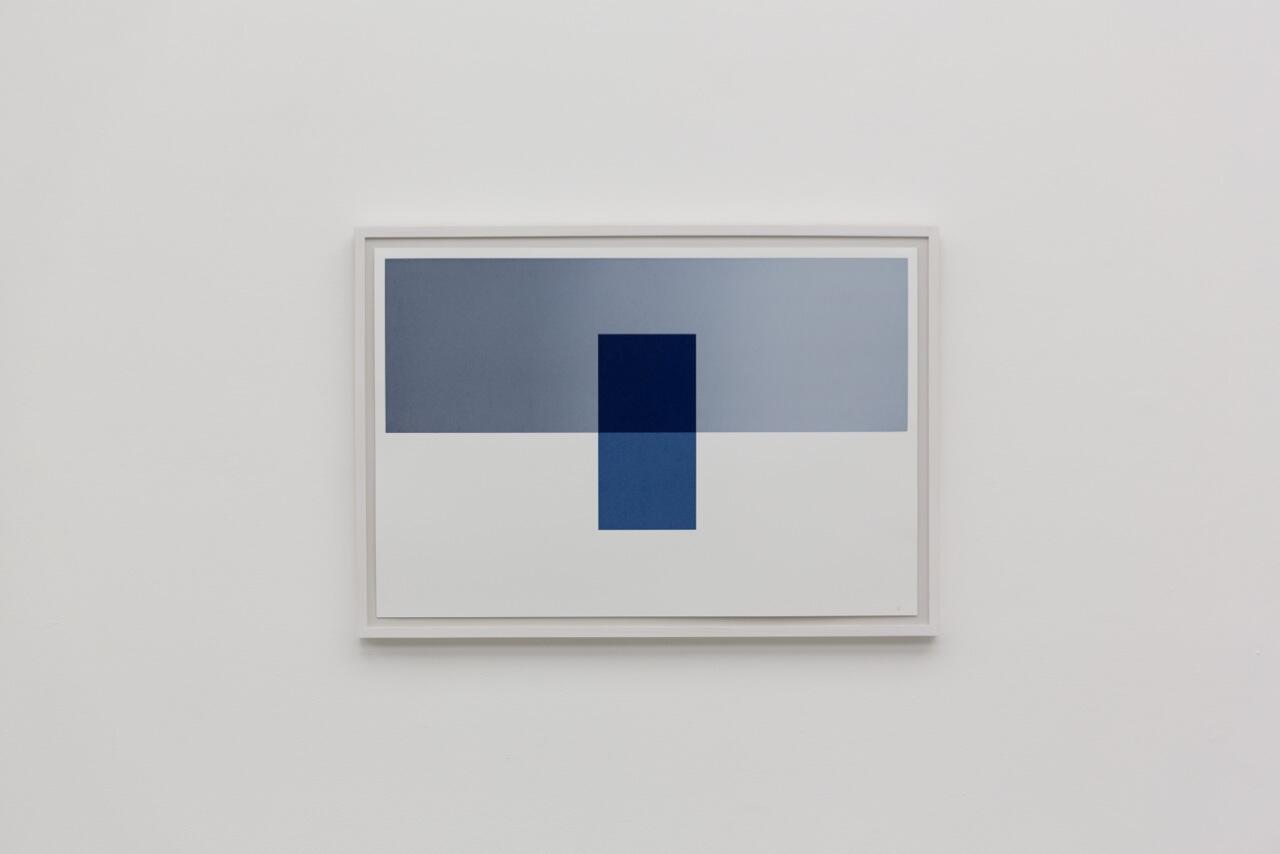
A series of 5 screenprints of abutting and overlaid geometrical shapes (greys, blues, yellow white that suggest interior spaces - but most of them are impossible ones.
Vanishing Point 1
Projection on to the wall of lines and shapes, fading in and out. They begin to describe an architectural space but at the point where this becomes an impossible one, things fade and reconfigure.
Vanishing Point 2
I found it disconcerting to have the light coming from the vanishing point when it 'should' disappear there.
The piece evoked for me my own confusion finding my way round buildings, and areas not looking as I remembered when I return to them. The lack of colour made it dreamlike, as did not knowing what I was really looking at in terms of size. An eery and perfect precision.
Thursday, 12 June 2014
Yuko Takada Keller
Tracing paper artist
From the home page of her website - http://www.yukotakada.com/ - she has so many interesting things to say about this material. I also love how poetic she is.

From the home page of her website - http://www.yukotakada.com/ - she has so many interesting things to say about this material. I also love how poetic she is.
| Welcome to my Home Page. I am Yuko Takada Keller, living in Helsinge, Denmark since 1997. I am a Japanese Artist and showing my work not only in Denmark but also in some other European countries as well as Japan. I also curate some exhibitions to intoduce Japanese artists in Denmark. I use tracing paper for my art. | |
About myself and my work | |
| I'm interested in using tracing paper, because it creates a sense of transparency and etherealness in my work. But when I was inUniversity, I majored in weaving. Then I wove woolen tapestries for some years. Before I entered University, I was impressed by the Northern European tapestries that I saw in a museum in Kyoto. This led me to major in weaving at University. However, while weaving the tapestries, I gradually wanted to express something different in my work. Then I took a trip to Northern Europe to see the tapestries there. Of course, I was very impressed by them, but I was more impressed by the magnificent scenery. I had never had that kind of feeling before in Japan. After this trip, I started to make my work using paper. At first, I used Japanese paper "washi". But I couldn't represent a sense of transparency with this paper. I tried to use various materials to represent a sense of transparency. Then I ran into tracing paper. "The Spread" is the first work where I used tracing paper. I colored the paper with acrylic color, then tore it into many pieces, and sewed them together. It gave me a feeling of transparency. I realized some possibilities using tracing paper. Because, while each piece has its own rhythm and direction taken in its entirety it seems to become something other than simple tracing paper. While making 2-dimensional works with tracing paper, I wanted to make pieces that were more 3-dimensional. I wanted to install my work in a space, not only hanging on a wall. "Prismatic" is the second work that I installed 3-dimensionally. It is one of my favorite works. It is composed of 7,500 pyramids. The theme of "Prismatic" is a shower of light that I felt in nature. "Prismatic" was traveling in U.K. in 1991 and in Canada from 1993 to 1995.  "Water fort" is one of the larger works. I made it from an image I saw in a dream. The story is like this: I was flying in the sky. It was above the water. I had no idea if the water was the sea or a lake or somewhere else. But it was really beautiful water. When I landed on the water, suddenly, the water stood up like a wall. Then I could walk through the water. I often have such strange dreams. After I've had this kind of dream, I don't understand if the dream is true or not. Sometimes I'm confused whether something is my dream or my memories, or maybe it's true.  It made me feel strongly how important water is not only for a human being but also for all lives in the world. Of course, I knew that intellectually. But it was the chance to consider life itself. After this trip, I made "Water roots". The water is the source of our life. I imagined there is incalculable energy under the ground as the "Water roots". In 1995, I got into a small slump. It wasn't so serious. But at that time, I was thinking about the skin membrane in my mind. The skin membrane in our mind sometimes tempt and control human's desire. According to the Buddhist thought, there are 108Bonnou in our mind. Bonnou means desire. "Pleats of a mind" consisted of 108 pieces, because they symbolically represent human desire in this work. This work was exhibited at the event "Container 96", a part of the celebration of Copenhagen as European Cultural Capital 1996. | |
From 1996, I have been using tiny small triangle pieces in my work. It symbolizes something like a molecule. A molecule of water or light or air. I would like to draw like a pointillism with this small piece as a molecule. "Between the Air" represents something like this feeling. When I am conscious of a skin membrane in the air, I can feel invisible things. It's something we have already forgotten or we don't try to see. But we have to remember, and we have to try to see. There is a value in this invisible world. "Expectation" is the last work I made before moving to Denmark in 1997. There are so many pieces combined with thin wire. It makes me feel the light is shining upon us, or rising up to our dream. Spring of 1997, my life in Denmark started, and I gave birth to my son in the end of this year at 39 years of age. I had a chance to reconsider about life itself. In the same time, I started to make my work to represent how respectable things we can make by our own hands. While considering the past of my life, I wanted to inform about that to the next generation like my son, because the new waves flushed away tons of information, and people will forget about the analogue way and so on. “C of Infornmation” came from that kind of idea. It represents the human who are floating on the discarded CD-ROMs which has already been thrown away, because there is no more useful (new) information there. That's why, I also use Origami-Technique as a typical analogue way. After, I moved to Denmark, I had my first solo exhibition at Gjethuset in Frederiksvaerk in 1999. “Life of the Blue” which I showed at my second solo exhibition at Portalen in Greve in January 2000 is my masterpiece in these 10 years. 
In the spring of 1999, my mother died and I get another opportunity to reconsider about humans life and my appreciation to my mother. There are about 50,000 tiny small triangle pieces in this work, and each single pieces has life even if you can't find the life. There are many important things (life) around us, but we can't find them, because we haven't tried to see carefully.
So, at the beginning of using tracing paper, I hoped my works would remind the viewer of something pure and natural in this world. Of course, I love and cherish the natural world, but I was interested in only the pure or beautiful world in nature. When I began to be conscious of a skin membrane in the tracing paper, I wanted to represent something more, not only pure or natural, in this world. It's sometimes in our mind.Yuko Takada Keller | |
Tracing paper has a transparency and an untransparency. I'm interested in how tracing paper is like a skin membrane. The skin membrane lies between dream and reality. The skin membrane lies between consciousness and behavior. The skin membrane is there when life is born. The skin membrane is part of a human being. I want to represent the space that people are aware of The skin membrane is unconsciousness. |
Fumio Hirakawa and Marina Topunova
Hope Tree


Architecture firm, 3o Studio. Paper cut out, LED lighting, in a shipping container. Created for 2010 Tokyo Designers Week.

The shapes that have been deliberately cut in the paper are like the ones I have captured at times through random interactions of cut shapes and light. At the same time they are picking up reflected shapes.
Intended as an environmental piece.
Bridget Riley
Appreciation - and the diagonals
In looking for titles for my cut paper hangings that point to their poetic aspect, I have turned to Bridget Riley's diagonal lozenge paintings which I saw for the first time at her Tate Britain show in 2003. Several galleries of them, huge, immersive in the field of colour and light that they projected. I don't think I have ever been filled with such joy by an exhibition: the dynamic of the upward-tilting shapes, the play with the geometry (lozenges slipping out of their columns), the interactions of so much saturated colour - and then the titles, which release the paintings from pure forms into the natural world. With lyrical simplicity, as in 'From here', 'Ease', 'New Day', 'High Sky','Reflection', 'Shade', 'June'.
I am recognising how influential she has been on me. Her aesthetic: clear, beautiful, an appeal to the senses, an engagement with the phenomenon of perception. Her gender: one of the few women artists who gained recognition and standing as early as the sixties. Her staying power: how she's kept going for over fifty years now, constantly evolving. In my studio I have pinned up right in front of where I work a photo of her standing in her studio in front of one of her more recent curvy paintings, with beneath a quote from her:
Those who continue to work at something they love seem blessed.
Yes.
I realise that she's so obvious to me, so present in my art life, that I have failed to do any research on her. So I wanted to focus for a while on these diagonal paintings, and have turned to the catalogue from that 2003 exhibition. This has been a revelation as to the complexity of her thinking (knowing that she composed the paintings from painted lozenge shapes has affected my interpretation of them, as a relationship between surface shapes and colours).
Up until the mid-80s BR had been working with stripes, straight and curving. Through the early 80s she had been in a transitional phase, moving from works that built up a tension between sensations that released a perceptual experience, to ones that 'take sensation as the guiding line and build, with the relationships it demands, a plastic fabric which has no other raison d'etre except to accommodate the sensations it elicits' (BR). So, a movement from the painting as a stimulant to a self-contained world. Her stripey paintings grew more and more complex and she realised she needed to return to first principles.
These were:
1. composition - the architecture of the painting, the relation of form and colour
2. the relation between the painting and nature - addressing the direct visual sensations of being in nature that precede interpretation and evaluation, that are immediate and fresh; complex relationships between space, line, tone and colour which 'provide a vehicle for those things which cannot be objectively identified but which nevertheless can be expressed in this way.' (BR) So immediate and suggestive.
Sensation central to both of these.
In 1986, as a way of exploring the internal relationships of a painting, she began to disrupt the vertical stripes with truncated diagonals (in 'Broken Gaze').
 This offset and opposed the verticality. But the effect is limited by the diagonals being contained within the stripes. Her next move was to let them overrun, creating a lattice effect that opens up depth, a dynamic depth in which shapes advance and recede. (This is what I hadn't noticed before because of my knowledge about the paintings' composition.) There is a tension between complexity (which could fall into chaos) and control. There is a new relationship between painting and viewer who now is drawn into the painting, maybe reading it sequentially, or moving from one area of colour and shape to another, or in and out of its depth. The early paintings pulsed, these unfold in time - they are a visual journey.
These paintings developed over the next 11 years, becoming more and more complex to the point where they risked fracturing. The viewer was faced with something increasingly multifocal with the eye needing to be correspondingly more restless.
In some of the late ones harmony is restored by using larger visual units. Nevertheless it was time to move on - into the current work which uses large curvy shapes.
But overall in this phase BR created paintings that realised 'a kind of place' (BR), 'a virtual arena defined entirely in terms of the spatial properties of form and colour' - but ones that could suggest to the viewer another place, one in the natural world.
I feel somewhat humbled that I borrowed the simple lozenge shape from these works for my cut hangings, thinking of it initially as an isolated unit - one that I could easily cut. At the same time, I have had to consider composition: the shapes have to be placed down somehow. The grid was an obvious choice for its simplicity; I wanted the minimum distraction from the light phenomena I was setting up and inviting.
Thinking about BR's aim of creating 'a kind of place' helps me understand a little more clearly my own work. Because it is an interaction between a material and natural light, it points more readily to the natural world both physically and imaginatively. The first, originally called 'Align' - a visual description - I'm now re-titling 'Longing to touch', because when I look at those triangles coming into alignment, that evokes an emotional response in me. 'Scatter', now 'Just this one high sky' for me can't help but evoke sky through its colour and the movement of clouds through the upward drift of the shapes, even though there was no intention in this. The last piece I've made 'By the grace of a low branch' was directly influenced by seeing sunlight on leaves - and my own need to offset line with curve. So the phenomenon of perception - the interaction between light and eye - is at their root but they are definitely not a self-contained space. The light passes through them, they are just an object in its path.
In looking for titles for my cut paper hangings that point to their poetic aspect, I have turned to Bridget Riley's diagonal lozenge paintings which I saw for the first time at her Tate Britain show in 2003. Several galleries of them, huge, immersive in the field of colour and light that they projected. I don't think I have ever been filled with such joy by an exhibition: the dynamic of the upward-tilting shapes, the play with the geometry (lozenges slipping out of their columns), the interactions of so much saturated colour - and then the titles, which release the paintings from pure forms into the natural world. With lyrical simplicity, as in 'From here', 'Ease', 'New Day', 'High Sky','Reflection', 'Shade', 'June'.
I am recognising how influential she has been on me. Her aesthetic: clear, beautiful, an appeal to the senses, an engagement with the phenomenon of perception. Her gender: one of the few women artists who gained recognition and standing as early as the sixties. Her staying power: how she's kept going for over fifty years now, constantly evolving. In my studio I have pinned up right in front of where I work a photo of her standing in her studio in front of one of her more recent curvy paintings, with beneath a quote from her:
Those who continue to work at something they love seem blessed.
Yes.
I realise that she's so obvious to me, so present in my art life, that I have failed to do any research on her. So I wanted to focus for a while on these diagonal paintings, and have turned to the catalogue from that 2003 exhibition. This has been a revelation as to the complexity of her thinking (knowing that she composed the paintings from painted lozenge shapes has affected my interpretation of them, as a relationship between surface shapes and colours).
Up until the mid-80s BR had been working with stripes, straight and curving. Through the early 80s she had been in a transitional phase, moving from works that built up a tension between sensations that released a perceptual experience, to ones that 'take sensation as the guiding line and build, with the relationships it demands, a plastic fabric which has no other raison d'etre except to accommodate the sensations it elicits' (BR). So, a movement from the painting as a stimulant to a self-contained world. Her stripey paintings grew more and more complex and she realised she needed to return to first principles.
These were:
1. composition - the architecture of the painting, the relation of form and colour
2. the relation between the painting and nature - addressing the direct visual sensations of being in nature that precede interpretation and evaluation, that are immediate and fresh; complex relationships between space, line, tone and colour which 'provide a vehicle for those things which cannot be objectively identified but which nevertheless can be expressed in this way.' (BR) So immediate and suggestive.
Sensation central to both of these.
In 1986, as a way of exploring the internal relationships of a painting, she began to disrupt the vertical stripes with truncated diagonals (in 'Broken Gaze').
 |
| Ease, 1987 |
 |
| High Sky 2, 1992 |
But overall in this phase BR created paintings that realised 'a kind of place' (BR), 'a virtual arena defined entirely in terms of the spatial properties of form and colour' - but ones that could suggest to the viewer another place, one in the natural world.
I feel somewhat humbled that I borrowed the simple lozenge shape from these works for my cut hangings, thinking of it initially as an isolated unit - one that I could easily cut. At the same time, I have had to consider composition: the shapes have to be placed down somehow. The grid was an obvious choice for its simplicity; I wanted the minimum distraction from the light phenomena I was setting up and inviting.
Thinking about BR's aim of creating 'a kind of place' helps me understand a little more clearly my own work. Because it is an interaction between a material and natural light, it points more readily to the natural world both physically and imaginatively. The first, originally called 'Align' - a visual description - I'm now re-titling 'Longing to touch', because when I look at those triangles coming into alignment, that evokes an emotional response in me. 'Scatter', now 'Just this one high sky' for me can't help but evoke sky through its colour and the movement of clouds through the upward drift of the shapes, even though there was no intention in this. The last piece I've made 'By the grace of a low branch' was directly influenced by seeing sunlight on leaves - and my own need to offset line with curve. So the phenomenon of perception - the interaction between light and eye - is at their root but they are definitely not a self-contained space. The light passes through them, they are just an object in its path.
Friday, 6 June 2014
Bill Viola at St Pauls
The Martyrs
This was hard to find, smaller than expected - and one of the screens wasn't working.
For me, size was an issue as I am familiar with the power of life-size figures in BV's videos.
My reading of the work was that the figures were dead, martyred as the title said, and that they were undergoing a process of purification through one of the four elements in order to 'ascend into heaven'; each eventually faced upwards and became bathed in silver life, an expression of surrender and bliss on their faces. So I was aware of two invisibilities - the torture they had been through and the heaven they were heading towards.
BV's explanation was somewhat different: that each video began at a point of pause in their suffering when an element began to disturb their stillness; the elements are metaphors for 'the darkest hour of the martyr's passage through darkness into light'. He describes a martyr as a witness (to their truth?) with a capacity to bear pain and death in order to remain faithful to their beliefs.
The videos in characteristic slo-mo which invites contemplation - in tension with the need to flit visually between screens to check whether something new is starting to happen. The inwardness of the actors' expressions also connected me to my own inner world; having suffered immensely, they were now going through something completely mysterious - the bardo of dying. Presumably still more powerful if you belong to a faith that honours martyrdom.
Friday, 9 May 2014
emptiness
A philosophy of emptiness
Gay Watson, Reaktion Books 2014
chapter 7, Artistic Emptiness
In contemporary art, the theme of emptiness manifests in the breakdown of barriers; a focus on process rather than product; playing in the space that is revealed; new forms tentatively emerging.
A forerunner of emptiness is the idea of the sublime, defined as experience that exceeds our perceptual or imaginative grasp, that marks the limit of reason. Today the sublime has come to intimate not transcendence/other but immanence - 'The sublime is NOW' (Barnett Newman) - and which expresses wonder, a sense of complexity and beauty.
There are many western artists who have become familiar with the teachings of Taoism and Buddhism, finding in them reflections of and responses to contemporary concerns. Expressions of emptiness in their work. Others have come to some understanding of emptiness through the popularisation of physics. The western mind seems to have a tendency to interpret emptiness nihilistically, as a lack or loss, rather than as both emptiness and fullness/ potential.
'...a space
utterly empty, utterly a source...'
(Seamus Heaney)
Discusses writing, music and dance.
On visual art, GW argues that the most significant movements in 20th century art were away from representation and classical perspective and toward the ephemeral, formless, contingent.
Phenomenon of immersion in pure colour e.g. Reinhardt, Klein, Rothko, Turrell - resulting in the loss of sense of distance, perspective.
Artists using light and natural world to enhance experience. Quotes a press release for a Turrell show which says: 'Light like this is seen rarely with the eyes open yet it is familiar (similar?) to that which can be apprehended with the eyes closed in lucid dream, deep meditation and near death experiences.' And Eliasson referring to 'what I sometimes call the introspective quality of seeing: you see whatever you're looking at, but you also see the way you're seeing.'
Other artists use their work to draw attention to attention itself: Martin, Celmins, Irwin, Tuttle, Whiteread, Viola. Show relationship between emptiness and formation, often requiring focused attention on the abstract or silent.
Kiefer, Walter de Maria, Kapoor, Gormley.
Emptiness if ambiguous: it can hold both escape/release and loss/failure. Art has the capacity to hold that ambiguity legitimately.
Space that is empty can be emphasised by the inclusion of a single simple object. Or it can be the whole subject of the work.
Attention - the need for both in creation and viewing - is the common thread in these artists.
Photography - cites a number of artists working with an oriental aesthetic. Photo as tathata; photography as a tool for challenging the assumption that the world is just the way it appears at first sight. Camera-less photography (qv) seems to be particularly successful in expressing ephemerality.
Connection with the meditating mind which puts the space of awareness around its objects.
Challenging 'the complacency of seeing', asking us 'to look more closely, with more attention, below the surface, around and within substance, in the silence between sounds, to find an unconventional way of seeing reality - to see, hear and think afresh.'
Thursday, 8 May 2014
Yinka Shonibare
The British Library

Installation in the old reference library at Brighton Museum as part of the 2014 Brighton Festival.
I heard YS in discussion with Hofesh Schechter, artistic director of the festival, on 7 May. Lots of interesting points especially on immigration, but for me in particular:
His approach to the installation: it was low budget, he could have covered all the old bookshelves and turned the room into a gallery space, but he decided - as he put it - to let the space give him the work, to be his muse i.e he worked from what was already there, the empty bookshelves, the library environment, the vestiges of its past.
[Although this is a well-established way of responding to site, there was something moving about the way he spoke that reinforced the approach which I connected how I want to work with my commission at Brighton Buddhist Centre.]
He also talked about authenticity: that the kind of fabric he uses everything thinks of as African and that he's making a point about colonialism when he splices it into typically British subjects. He takes pleasure in the fact that it's in fact Dutch-Indonesian in origin, so the use of it parodies authenticity. (Of course it still makes a point about colonialism. . . )
Friday, 2 May 2014
phenomenology
Understanding phenomenology
David R Cerbone (Acumen 2006)
Ch 4 on Merleau-Ponty
M-P's phenomenology aims to describe our embodied perceptual experience of the world, our sense of subjectivity and emerging object - before we divide our experience into subject and object.
Slogan: "I am open to the world" - to direct experience without analysing, naming, explaining, judging
This openness is however intentional in that we choose to engage with particular people, objects, situations. What we engage with is always within a context or ground and emotional response is not separate from it; the experience is imbued with that emotion. You can't split the physiological and psychological.
It's open-endedness means that 'nothing is more difficult than to know precisely what we see'.
Gay Watson in 'A philosophy of emptiness' ( Reaktion Books 2014) says that M-P thought we tended to take a representational view of bodily experience, and that he wanted us to question this and really see what was going on through a practice of attentiveness. He wrote: 'True philosophy consists in re-learning to look at the world.'
The idea of presence is key; mind/body and subject/world are abstractions from this - 'reinstating the embodied subject as one that is never distinct and separated, but always intentionally related to the world'. A person has a dynamic relation with the world, is connected. Being embodied one is both visible and seeing.
Tuesday, 22 April 2014
light painting photography
Have just stumbled across this genre almost by chance while researching something else. At the moment I don't completely understand how it's done - a combination of moving light and slow exposure? - but it's as if movement and time are frozen into a single image eg.

or illusory structures created out of light e.g.

http://lightpaintingphotography.com/light-painting-history/

Gijon Mili, Picasso Paints a Centaur
or illusory structures created out of light e.g.

Eric Staller, Ribbon on Hannover Street 1976
http://lightpaintingphotography.com/light-painting-history/
Thursday, 17 April 2014
Matisse
The Cut-Outs at Tate Modern
Initially hard to know how to respond because the images were mostly so familiar.
I decided to jot down words in response as I walked round:
saturated colour asymmetry morphable patchwork backgrounds surprises celebratory rough cut edges free playful rapidity joyful movement decorative big rhythmic sculptural abundant not neat curvy simple
His cut-outs the complete opposite of mine which are measured, geometric, mostly straight-edged, non-representational, cut on the flat with a knife, involving control and tension in my body. I envy his freedom of working, but then I have been trying to achieve something very different; I have been cutting shapes out of the middle of whole sheets, creating negative spaces - until this week when I have experimented with placing shapes between transparent sheets. How would it be to do some of these 'in the round'? What shapes would I choose - ones that don't need to be cut carefully?
Cutting was a dynamic process, Matisse holding the sheet out in front of himself and moving into it. He said, comparing this process with painting: 'The conditions of the journey are 100% different. The contour of the figure springs from the discovery of the scissors that give it the movement of circulating life. This tool doesn't modulate, it doesn't brush on, but it incises in, underline this well, because the criteria of observation will be different.' This last point is interesting, hinting at the three-dimensionality of the work. His assistant, Lydia Delectorskya, spoke of 'modelling it [a Blue Nude] like a clay sculpture: sometimes adding, sometimes removing.'
Assembly also dynamic, the shapes being adjusted in their relative positions many times over.
Rare layering of shapes:
Use of text:

Initially hard to know how to respond because the images were mostly so familiar.
I decided to jot down words in response as I walked round:
saturated colour asymmetry morphable patchwork backgrounds surprises celebratory rough cut edges free playful rapidity joyful movement decorative big rhythmic sculptural abundant not neat curvy simple
His cut-outs the complete opposite of mine which are measured, geometric, mostly straight-edged, non-representational, cut on the flat with a knife, involving control and tension in my body. I envy his freedom of working, but then I have been trying to achieve something very different; I have been cutting shapes out of the middle of whole sheets, creating negative spaces - until this week when I have experimented with placing shapes between transparent sheets. How would it be to do some of these 'in the round'? What shapes would I choose - ones that don't need to be cut carefully?
Cutting was a dynamic process, Matisse holding the sheet out in front of himself and moving into it. He said, comparing this process with painting: 'The conditions of the journey are 100% different. The contour of the figure springs from the discovery of the scissors that give it the movement of circulating life. This tool doesn't modulate, it doesn't brush on, but it incises in, underline this well, because the criteria of observation will be different.' This last point is interesting, hinting at the three-dimensionality of the work. His assistant, Lydia Delectorskya, spoke of 'modelling it [a Blue Nude] like a clay sculpture: sometimes adding, sometimes removing.'
Assembly also dynamic, the shapes being adjusted in their relative positions many times over.
Rare layering of shapes:
 |
| Mimosa |
Alastair Sooke, Henri Matisse: A Second Life
A few points about the cut-outs this highlighted for me:
They were made against a backdrop of pain - the war (begun in 1941), the extreme torture of his daughter by the Nazis, the physical pain of his illness.
He used the medium to drive what he thought of as a second life as an artist.
100s of them, most made as models for something else (book covers, scarves. . . )
He carved the paper with scissors, only closing the blades for angles; did not draw the shapes on to the paper, only as preparatory sketches.
Decorative relationship in Jazz between his handwriting and the images - large-scale; lively looping and flourishes.
M felt that what he had created before 1941 required too much effort; now he was working freely.
Saw The Lyre as his first proper, well thought-out cut-out
Oceania arose out of deeply held memories of his time in Polynesia in 1930, released during sleepless nights. He had produced very little work during the trip itself.
Chapel at Vence: designed not just walls and windows but every decorative element from the wooden confessional door to the priest's robes. Saw its origin in Jazz, with maquettes being made out of cut paper. Kept colours simple, no red, so they could act with greatest force on the viewer. Huge technical difficulties - finding the right colours, most of the tiles breaking at one firing - but none of this is betrayed. Very pleased with the result: 'When I go into the chapel, I feel that my whole being is there...'
'I believe that my role is to provide calm. Because I myself have need of peace.'
Though admired in US, in France they tended to be treated as trivial, the waning work of an old man. M considered these works the equal of his paintings.
Close study shows lots of tiny paper additions, as if something is being moulded.
Drawing on top of gouache in Blue Nudes.
Some edges torn.
Visible pinholes.
As his own life grew more restricted, so the cut-outs evoked worlds and beings that made him happy - an imagined freedom.
Conscioulsy drew on oriental art in his use of negative space.
Tuesday, 15 April 2014
magic lanterns

Through the university archivist I was introduced to Trevor and his collection of magic lanterns in Hove. I was interested in these because they were an early way of projecting light images, which is what in a very simple way I have been doing in my work. Trevor showed his collection which ranges from the earliest and simplest candle lanterns to the most sophisticated which can overlay up to 3 images at a time. He then gave a slide show. Some of the points I noted:
- A magic lantern has three basic components: a source of light, a slide with an image on it and a lens whose curvature enlarges the image.
- We tend to think of lanterns as a Victorian phenomenon that was quickly superceded by cinema, but in fact they were developed in the mid 17th century and carried on being quite commonly used until the mid 20th.
- The slides, which are less than 3" in size, were initially hand-painted with varying degrees of skill, but later had photographs printed or impressed on them.
- The projected colours are vivid and the luminosity creates great depth to the image by comparison with say a painting.
- Slides were used in a different way to movies. They often had a religious, travel or scientific content and so were used educationally. There was also a strong performance element, a relationship between the person showing the slides and the content (talking, perhaps shocking or frightening, making sounds).
- 2 or 3 slides could be made to interact to create the illusion of movement. I found this particularly interesting in relation to my own work in the case of slides with geometric patterns which in interaction created a kaleidoscopic effect.

- Children often had their own magic lantern.
- The 19th century slides reflect their time and contain a lot of racism, cruelty to children and animals.
Source of slides: www.slides.uni-trier.de
Seeing the lanterns suggested the idea to me of adding a simple form to the areas of light I had been projecting on to tracing paper, which added to the
Subscribe to:
Comments (Atom)