Monday, 16 June 2014

United Visual Artists

Vanishing Point
Exhibition at Towner Gallery, Eastbourne

UVA is a multi-disciplinary collective that combines sculpure, installation, performance and architecture.  They reference Alberti, da Vinci and Durer.  They experiment with technologies and materials to take themselves in fresh artistic directions, and explore the tension between real and artificially created experiences.  The gallery literature says of them:  'A fascination with the physical presence of light is embedded in their work and they explore different ways of creating a structure from light by employing perspective as both a tool and visual outcome to reshape, redefine and represent a space.'

3 works showing in this exhibition of increasing immateriality:

Vanishing Point 3


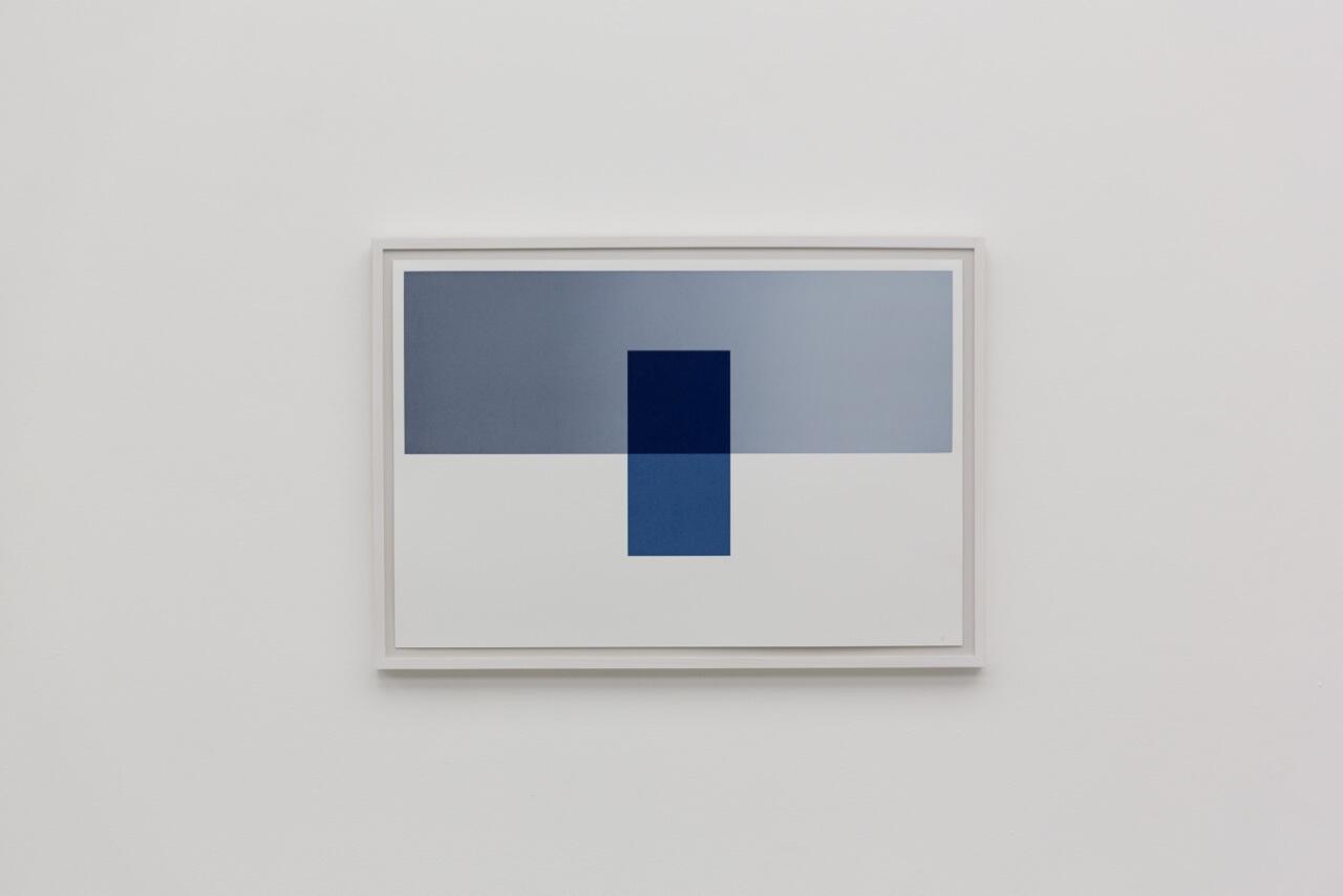
A series of 5 screenprints of abutting and overlaid geometrical shapes (greys, blues, yellow white that suggest interior spaces - but most of them are impossible ones.

Vanishing Point 1
Projection on to the wall of lines and shapes, fading in and out.  They begin to describe an architectural space but at the point where this becomes an impossible one, things fade and reconfigure.

Vanishing Point 2

United Visual Artists

The viewer enters a dark room where light is being projected from a vanishing point - which seems much more distant than it can possibly be. The beams create changing lines and walls of light which the viewer can stand between or interrupt.  
I found it disconcerting to have the light coming from the vanishing point when it 'should' disappear there.
The piece evoked for me my own confusion finding my way round buildings, and areas not looking as I remembered when I return to them. The lack of colour made it dreamlike, as did not knowing what I was really looking at in terms of size.  An eery and perfect precision.

Thursday, 12 June 2014

Yuko Takada Keller

Tracing paper artist
From the home page of her website - http://www.yukotakada.com/ - she has so many interesting things to say about this material.  I also love how poetic she is.


Welcome to my Home Page.
I am Yuko Takada Keller, living in Helsinge, Denmark since 1997. I am a Japanese Artist and showing my work not only in Denmark but also in some other European countries as well as Japan. I also curate some exhibitions to intoduce Japanese artists in Denmark. I use tracing paper for my art.

About myself and my work

I'm interested in using tracing paper, because it creates a sense of transparency and etherealness in my work. But when I was inUniversity, I majored in weaving. Then I wove woolen tapestries for some years. Before I entered University, I was impressed by the Northern European tapestries that I saw in a museum in Kyoto. This led me to major in weaving at University.
However, while weaving the tapestries, I gradually wanted to express something different in my work. Then I took a trip to Northern Europe to see the tapestries there. Of course, I was very impressed by them, but I was more impressed by the magnificent scenery. I had never had that kind of feeling before in Japan.
After this trip, I started to make my work using paper.
At first, I used Japanese paper "washi". But I couldn't represent a sense of transparency with this paper. I tried to use various materials to represent a sense of transparency. Then I ran into tracing paper.
"The Spread" is the first work where I used tracing paper. I colored the paper with acrylic color, then tore it into many pieces, and sewed them together. It gave me a feeling of transparency. I realized some possibilities using tracing paper. Because, while each piece has its own rhythm and direction taken in its entirety it seems to become something other than simple tracing paper.
While making 2-dimensional works with tracing paper, I wanted to make pieces that were more 3-dimensional. I wanted to install my work in a space, not only hanging on a wall.
"Prismatic" is the second work that I installed 3-dimensionally. It is one of my favorite works. It is composed of 7,500 pyramids. The theme of "Prismatic" is a shower of light that I felt in nature. "Prismatic" was traveling in U.K. in 1991 and in Canada from 1993 to 1995.
When I was making "Hazy forest", I began to be conscious that tracing paper has not only a transparency but also an untransparency. I feel there is something like a skin membrane between a transparency and an untransparency. I glue small pieces which were torn in plane, then I install it in a space. Using this technique, I have been making some works. They have been getting larger or the parts themselves have been 3-dimensional.
"Water fort" is one of the larger works. I made it from an image I saw in a dream. The story is like this: I was flying in the sky. It was above the water. I had no idea if the water was the sea or a lake or somewhere else. But it was really beautiful water. When I landed on the water, suddenly, the water stood up like a wall. Then I could walk through the water. I often have such strange dreams. After I've had this kind of dream, I don't understand if the dream is true or not. Sometimes I'm confused whether something is my dream or my memories, or maybe it's true.
In 1993, I traveled in Tanzania. It was a harsh world. I experienced the life of no water.
It made me feel strongly how important water is not only for a human being but also for all lives in the world. Of course, I knew that intellectually. But it was the chance to consider life itself. After this trip, I made "Water roots". The water is the source of our life. I imagined there is incalculable energy under the ground as the "Water roots".
In 1995, I got into a small slump. It wasn't so serious. But at that time, I was thinking about the skin membrane in my mind. The skin membrane in our mind sometimes tempt and control human's desire. According to the Buddhist thought, there are 108Bonnou in our mind. Bonnou means desire. "Pleats of a mind" consisted of 108 pieces, because they symbolically represent human desire in this work. This work was exhibited at the event "Container 96", a part of the celebration of Copenhagen as European Cultural Capital 1996.


From 1996, I have been using tiny small triangle pieces in my work. It symbolizes something like a molecule. A molecule of water or light or air. I would like to draw like a pointillism with this small piece as a molecule. "Between the Air" represents something like this feeling. When I am conscious of a skin membrane in the air, I can feel invisible things. It's something we have already forgotten or we don't try to see. But we have to remember, and we have to try to see. There is a value in this invisible world.
"Expectation" is the last work I made before moving to Denmark in 1997. There are so many pieces combined with thin wire. It makes me feel the light is shining upon us, or rising up to our dream.
Spring of 1997, my life in Denmark started, and I gave birth to my son in the end of this year at 39 years of age. I had a chance to reconsider about life itself. In the same time, I started to make my work to represent how respectable things we can make by our own hands. While considering the past of my life, I wanted to inform about that to the next generation like my son, because the new waves flushed away tons of information, and people will forget about the analogue way and so on.
“C of Infornmation” came from that kind of idea. It represents the human who are floating on the discarded CD-ROMs which has already been thrown away, because there is no more useful (new) information there. That's why, I also use Origami-Technique as a typical analogue way.
After, I moved to Denmark, I had my first solo exhibition at Gjethuset in Frederiksvaerk in 1999.   “Life of the Blue” which I showed at my second solo exhibition at Portalen in Greve in January 2000 is my masterpiece in these 10 years.
In the spring of 1999, my mother died and I get another opportunity to reconsider about humans life and my appreciation to my mother. There are about 50,000 tiny small triangle pieces in this work, and each single pieces has life even if you can't find the life. There are many important things (life) around us, but we can't find them, because we haven't tried to see carefully.
So, at the beginning of using tracing paper, I hoped my works would remind the viewer of something pure and natural in this world. Of course, I love and cherish the natural world, but I was interested in only the pure or beautiful world in nature. When I began to be conscious of a skin membrane in the tracing paper, I wanted to represent something more, not only pure or natural, in this world. It's sometimes in our mind.
Yuko Takada Keller

Tracing paper has a transparency and an untransparency.
I'm interested in how tracing paper is like a skin membrane.
The skin membrane lies between dream and reality.
The skin membrane lies between consciousness and behavior.
The skin membrane is there when life is born.
The skin membrane is part of a human being.
I want to represent the space that people are aware of
The skin membrane is unconsciousness.

Fumio Hirakawa and Marina Topunova

Hope Tree


Architecture firm, 3o Studio.  Paper cut out, LED lighting, in a shipping container. Created for 2010 Tokyo Designers Week.


The shapes that have been deliberately cut in the paper are like the ones I have captured at times through random interactions of cut shapes and light.  At the same time they are picking up reflected shapes.

Intended as an environmental piece.

Bridget Riley

Appreciation - and the diagonals
In looking for titles for my cut paper hangings that point to their poetic aspect, I have turned to Bridget Riley's diagonal lozenge paintings which I saw for the first time at her Tate Britain show in 2003. Several galleries of them, huge, immersive in the field of colour and light that they projected.  I don't think I have ever been filled with such joy by an exhibition: the dynamic of the upward-tilting shapes, the play with the geometry (lozenges slipping out of their columns), the interactions of so much saturated colour - and then the titles, which release  the paintings from pure forms into the natural world. With lyrical simplicity, as in 'From here', 'Ease', 'New Day', 'High Sky','Reflection', 'Shade', 'June'.  

I am recognising how influential she has been on me.  Her aesthetic: clear, beautiful, an appeal to the senses, an engagement with the phenomenon of perception.  Her gender: one of the few women artists who gained recognition and standing as early as the sixties. Her staying power: how she's kept going for over fifty years now, constantly evolving.  In my studio I have pinned up right in front of where I work a photo of her standing in her studio in front of one of her more recent curvy paintings, with beneath a quote from her:

    Those who continue to work at something they love seem blessed.

Yes.

I realise that she's so obvious to me, so present in my art life, that I have failed to do any research on her.  So I wanted to focus for a while on these diagonal paintings, and have turned to the catalogue from that 2003 exhibition.  This has been a revelation as to the complexity of her thinking (knowing that she composed the paintings from painted lozenge shapes has affected my interpretation of them, as a relationship between surface shapes and colours).  

Up until the mid-80s BR had been working with stripes, straight and curving.  Through the early 80s she had been in a transitional phase, moving from works that built up a tension between sensations that released a perceptual experience, to ones that 'take sensation as the guiding line and build, with the relationships it demands, a plastic fabric which has no other raison d'etre except to accommodate the sensations it elicits' (BR).  So, a movement from the painting as a stimulant to a self-contained world.  Her stripey paintings grew more and more complex and she realised she needed to return to first principles. 

These were:
1.  composition - the architecture of the painting, the relation of form and colour
2.  the relation between the painting and nature - addressing the direct visual sensations of being in nature that precede interpretation and evaluation, that are immediate and fresh; complex relationships between space, line, tone and colour which 'provide a vehicle for those things which cannot be objectively identified but which nevertheless can be expressed in this way.' (BR) So immediate and suggestive.
Sensation central to both of these.

In 1986, as a way of exploring the internal relationships of a painting, she began to disrupt the vertical stripes with truncated diagonals (in 'Broken Gaze').
 This offset and opposed the verticality. But the effect is limited by the diagonals being contained within the stripes.  Her next move was to let them overrun, creating a lattice effect that opens up depth, a dynamic depth in which shapes advance and recede.  (This is what I hadn't noticed before because of my knowledge about the paintings' composition.)  There is a tension between complexity (which could fall into chaos) and control.  There is a new relationship between painting and viewer who now is drawn into the painting, maybe reading it sequentially, or moving from one area of colour and shape to another, or in and out of its depth. The early paintings pulsed, these unfold in time - they are a visual journey.
Ease, 1987
These paintings developed over the next 11 years, becoming more and more complex to the point where they risked fracturing.  The viewer was faced with something increasingly multifocal with the eye needing to be correspondingly more restless. 
High Sky 2, 1992
In some of the late ones harmony is restored by using larger visual units.  Nevertheless it was time to move on - into the current work which uses large curvy shapes.

But overall in this phase BR created paintings that realised 'a kind of place' (BR), 'a virtual arena defined entirely in terms of the spatial properties of form and colour' - but ones that could suggest to the viewer another place, one in the natural world.

I feel somewhat humbled that I borrowed the simple lozenge shape from these works for my cut hangings, thinking of it initially as an isolated unit - one that I could easily cut.  At the same time, I have had to consider composition: the shapes have to be placed down somehow.  The grid was an obvious choice for its simplicity; I wanted the minimum distraction from the light phenomena I was setting up and inviting. 

Thinking about BR's aim of creating 'a kind of place' helps me understand a little more clearly my own work.  Because it is an interaction between a material and natural light, it points more readily to the natural world both physically and imaginatively.  The first, originally called 'Align' - a visual description - I'm now re-titling 'Longing to touch', because when I look at those triangles coming into alignment, that evokes an emotional response in me.  'Scatter', now 'Just this one high sky' for me can't help but evoke sky through its colour and the movement of clouds through the upward drift of the shapes, even though there was no intention in this. The last piece I've made 'By the grace of a low branch' was directly influenced by seeing sunlight on leaves - and my own need to offset line with curve.  So the phenomenon of perception - the interaction between light and eye - is at their root but they are definitely not a self-contained space.  The light passes through them, they are just an object in its path.


Friday, 6 June 2014

Bill Viola at St Pauls

The Martyrs
This was hard to find, smaller than expected - and one of the screens wasn't working.
For me, size was an issue as I am familiar with the power of life-size figures in BV's videos.

My reading of the work was that the figures were dead, martyred as the title said, and that they were undergoing a process of purification through one of the four elements in order to 'ascend into heaven'; each eventually faced upwards and became bathed in silver life, an expression of surrender and bliss on their faces.  So I was aware of two invisibilities - the torture they had been through and the heaven they were heading towards. 

BV's explanation was somewhat different: that each video began at a point of pause in their suffering when an element began to disturb their stillness; the elements are metaphors for 'the darkest hour of the martyr's passage through darkness into light'. He describes a martyr as a witness (to their truth?) with a capacity to bear pain and death in order to remain faithful to their beliefs. 

The videos in characteristic slo-mo which invites contemplation - in tension with the need to flit visually between screens to check whether something new is starting to happen.  The inwardness of the actors' expressions also connected me to my own inner world; having suffered immensely, they were now going through something completely mysterious - the bardo of dying.  Presumably still more powerful if you belong to a faith that honours martyrdom.