Thursday, 12 June 2014

Fumio Hirakawa and Marina Topunova

Hope Tree


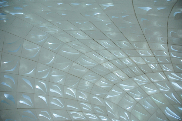
Architecture firm, 3o Studio.  Paper cut out, LED lighting, in a shipping container. Created for 2010 Tokyo Designers Week.


The shapes that have been deliberately cut in the paper are like the ones I have captured at times through random interactions of cut shapes and light.  At the same time they are picking up reflected shapes.

Intended as an environmental piece.

Bridget Riley

Appreciation - and the diagonals
In looking for titles for my cut paper hangings that point to their poetic aspect, I have turned to Bridget Riley's diagonal lozenge paintings which I saw for the first time at her Tate Britain show in 2003. Several galleries of them, huge, immersive in the field of colour and light that they projected.  I don't think I have ever been filled with such joy by an exhibition: the dynamic of the upward-tilting shapes, the play with the geometry (lozenges slipping out of their columns), the interactions of so much saturated colour - and then the titles, which release  the paintings from pure forms into the natural world. With lyrical simplicity, as in 'From here', 'Ease', 'New Day', 'High Sky','Reflection', 'Shade', 'June'.  

I am recognising how influential she has been on me.  Her aesthetic: clear, beautiful, an appeal to the senses, an engagement with the phenomenon of perception.  Her gender: one of the few women artists who gained recognition and standing as early as the sixties. Her staying power: how she's kept going for over fifty years now, constantly evolving.  In my studio I have pinned up right in front of where I work a photo of her standing in her studio in front of one of her more recent curvy paintings, with beneath a quote from her:

    Those who continue to work at something they love seem blessed.

Yes.

I realise that she's so obvious to me, so present in my art life, that I have failed to do any research on her.  So I wanted to focus for a while on these diagonal paintings, and have turned to the catalogue from that 2003 exhibition.  This has been a revelation as to the complexity of her thinking (knowing that she composed the paintings from painted lozenge shapes has affected my interpretation of them, as a relationship between surface shapes and colours).  

Up until the mid-80s BR had been working with stripes, straight and curving.  Through the early 80s she had been in a transitional phase, moving from works that built up a tension between sensations that released a perceptual experience, to ones that 'take sensation as the guiding line and build, with the relationships it demands, a plastic fabric which has no other raison d'etre except to accommodate the sensations it elicits' (BR).  So, a movement from the painting as a stimulant to a self-contained world.  Her stripey paintings grew more and more complex and she realised she needed to return to first principles. 

These were:
1.  composition - the architecture of the painting, the relation of form and colour
2.  the relation between the painting and nature - addressing the direct visual sensations of being in nature that precede interpretation and evaluation, that are immediate and fresh; complex relationships between space, line, tone and colour which 'provide a vehicle for those things which cannot be objectively identified but which nevertheless can be expressed in this way.' (BR) So immediate and suggestive.
Sensation central to both of these.

In 1986, as a way of exploring the internal relationships of a painting, she began to disrupt the vertical stripes with truncated diagonals (in 'Broken Gaze').
 This offset and opposed the verticality. But the effect is limited by the diagonals being contained within the stripes.  Her next move was to let them overrun, creating a lattice effect that opens up depth, a dynamic depth in which shapes advance and recede.  (This is what I hadn't noticed before because of my knowledge about the paintings' composition.)  There is a tension between complexity (which could fall into chaos) and control.  There is a new relationship between painting and viewer who now is drawn into the painting, maybe reading it sequentially, or moving from one area of colour and shape to another, or in and out of its depth. The early paintings pulsed, these unfold in time - they are a visual journey.
Ease, 1987
These paintings developed over the next 11 years, becoming more and more complex to the point where they risked fracturing.  The viewer was faced with something increasingly multifocal with the eye needing to be correspondingly more restless. 
High Sky 2, 1992
In some of the late ones harmony is restored by using larger visual units.  Nevertheless it was time to move on - into the current work which uses large curvy shapes.

But overall in this phase BR created paintings that realised 'a kind of place' (BR), 'a virtual arena defined entirely in terms of the spatial properties of form and colour' - but ones that could suggest to the viewer another place, one in the natural world.

I feel somewhat humbled that I borrowed the simple lozenge shape from these works for my cut hangings, thinking of it initially as an isolated unit - one that I could easily cut.  At the same time, I have had to consider composition: the shapes have to be placed down somehow.  The grid was an obvious choice for its simplicity; I wanted the minimum distraction from the light phenomena I was setting up and inviting. 

Thinking about BR's aim of creating 'a kind of place' helps me understand a little more clearly my own work.  Because it is an interaction between a material and natural light, it points more readily to the natural world both physically and imaginatively.  The first, originally called 'Align' - a visual description - I'm now re-titling 'Longing to touch', because when I look at those triangles coming into alignment, that evokes an emotional response in me.  'Scatter', now 'Just this one high sky' for me can't help but evoke sky through its colour and the movement of clouds through the upward drift of the shapes, even though there was no intention in this. The last piece I've made 'By the grace of a low branch' was directly influenced by seeing sunlight on leaves - and my own need to offset line with curve.  So the phenomenon of perception - the interaction between light and eye - is at their root but they are definitely not a self-contained space.  The light passes through them, they are just an object in its path.


Friday, 6 June 2014

Bill Viola at St Pauls

The Martyrs
This was hard to find, smaller than expected - and one of the screens wasn't working.
For me, size was an issue as I am familiar with the power of life-size figures in BV's videos.

My reading of the work was that the figures were dead, martyred as the title said, and that they were undergoing a process of purification through one of the four elements in order to 'ascend into heaven'; each eventually faced upwards and became bathed in silver life, an expression of surrender and bliss on their faces.  So I was aware of two invisibilities - the torture they had been through and the heaven they were heading towards. 

BV's explanation was somewhat different: that each video began at a point of pause in their suffering when an element began to disturb their stillness; the elements are metaphors for 'the darkest hour of the martyr's passage through darkness into light'. He describes a martyr as a witness (to their truth?) with a capacity to bear pain and death in order to remain faithful to their beliefs. 

The videos in characteristic slo-mo which invites contemplation - in tension with the need to flit visually between screens to check whether something new is starting to happen.  The inwardness of the actors' expressions also connected me to my own inner world; having suffered immensely, they were now going through something completely mysterious - the bardo of dying.  Presumably still more powerful if you belong to a faith that honours martyrdom.

Friday, 9 May 2014

emptiness

A philosophy of emptiness
Gay Watson, Reaktion Books 2014

chapter 7, Artistic Emptiness 
In contemporary art, the theme of emptiness manifests in the breakdown of barriers; a focus on process rather than product; playing in the space that is revealed; new forms tentatively emerging. 

A forerunner of emptiness is the idea of the sublime, defined as experience that exceeds our perceptual or imaginative grasp, that marks the limit of reason. Today the sublime has come to intimate not transcendence/other but immanence - 'The sublime is NOW' (Barnett Newman) - and which expresses wonder, a sense of complexity and beauty.

There are many western artists who have become familiar with the teachings of Taoism and Buddhism, finding in them reflections of and responses to contemporary concerns. Expressions of emptiness in their work. Others have come to some understanding of emptiness through the popularisation of physics. The western mind seems to have a tendency to interpret emptiness nihilistically, as a lack or loss, rather than as both emptiness and fullness/ potential.

                                                   '...a space
                         utterly empty, utterly a source...'
                                                 (Seamus Heaney)

Discusses writing, music and dance.

On visual art, GW argues that the most significant movements in 20th century art were away from representation and classical perspective and toward the ephemeral, formless, contingent.

Phenomenon of immersion in pure colour e.g. Reinhardt, Klein, Rothko, Turrell - resulting in the loss of sense of distance, perspective.  

Artists using light and natural world to enhance experience.  Quotes a press release for a Turrell show which says: 'Light like this is seen rarely with the eyes open yet it is familiar (similar?) to that which can be apprehended with the eyes closed in lucid dream, deep meditation and near death experiences.'  And Eliasson referring to 'what I sometimes call the introspective quality of seeing: you see whatever you're looking at, but you also see the way you're seeing.'

Other artists use their work to draw attention to attention itself: Martin, Celmins, Irwin, Tuttle, Whiteread, Viola.  Show relationship between emptiness and formation, often requiring focused attention on the abstract or silent.

Kiefer, Walter de Maria, Kapoor, Gormley.

Emptiness if ambiguous: it can hold both escape/release and loss/failure.  Art has the capacity to hold that ambiguity legitimately.

Space that is empty can be emphasised by the inclusion of a single simple object.  Or it can be the whole subject of the work.

Attention - the need for both in creation and viewing - is the common thread in these artists.

Photography - cites a number of artists working with an oriental aesthetic.  Photo as tathata; photography as a tool for challenging the assumption that the world is just the way it appears at first sight.  Camera-less photography (qv) seems to be particularly successful in expressing ephemerality.

Connection with the meditating mind which puts the space of awareness around its objects.

Challenging 'the complacency of seeing', asking us 'to look more closely, with more attention, below the surface, around and within substance, in the silence between sounds, to find an unconventional way of seeing reality - to see, hear and think afresh.'

Thursday, 8 May 2014

Yinka Shonibare

The British Library

Installation in the old reference library at Brighton Museum as part of the 2014 Brighton Festival. 

I heard YS in discussion with Hofesh Schechter, artistic director of the festival, on 7 May. Lots of interesting points especially on immigration, but for me in particular:

His approach to the installation: it was low budget, he could have covered all the old bookshelves and turned the room into a gallery space, but he decided - as he put it - to let the space give him the work, to be his muse i.e he worked from what was already there, the empty bookshelves, the library environment, the vestiges of its past.  

[Although this is a well-established way of responding to site, there was something moving about the way he spoke that reinforced the approach which I connected how I want to work with my commission at Brighton Buddhist Centre.]

He also talked about authenticity: that the kind of fabric he uses everything thinks of as African and that he's making a point about colonialism when he splices it into typically British subjects.  He takes pleasure in the fact that it's in fact Dutch-Indonesian in origin, so the use of it parodies authenticity.  (Of course it still makes a point about colonialism. . . )


Friday, 2 May 2014

phenomenology

Understanding phenomenology
David R Cerbone (Acumen 2006)
Ch 4 on Merleau-Ponty
M-P's phenomenology aims to describe our embodied perceptual experience of the world, our sense of subjectivity and emerging object - before we divide our experience into subject and object.
Slogan: "I am open to the world" - to direct experience without analysing, naming, explaining, judging
This openness is however intentional in that we choose to engage with particular people, objects, situations.  What we engage with is always within a context or ground and emotional response is not separate from it; the experience is imbued with that emotion.  You can't split the physiological and psychological.
It's open-endedness means that 'nothing is more difficult than to know precisely what we see'.

Gay Watson in 'A philosophy of emptiness' ( Reaktion Books 2014) says that M-P thought we tended to take a representational view of bodily experience, and that he wanted us to question this and really see what was going on through a practice of attentiveness.  He wrote: 'True philosophy consists in re-learning to look at the world.'
The idea of presence is key; mind/body and subject/world are abstractions from this - 'reinstating the embodied subject as one that is never  distinct and separated, but always intentionally related to the world'.  A person has a dynamic relation with the world, is connected.  Being embodied one is both visible and seeing.

Tuesday, 22 April 2014

light painting photography

Have just stumbled across this genre almost by chance while researching something else. At the moment I don't completely understand how it's done - a combination of moving light and slow exposure? - but it's as if movement and time are frozen into a single image eg.
Picasso Draws a Centaur, Pablo Picasso by Light Painting Photographer Gjon Mili
Gijon Mili, Picasso Paints a Centaur

or illusory structures created out of light e.g.


Erci Staller's Ribbon on Hannover Street
Eric Staller, Ribbon on Hannover Street 1976


http://lightpaintingphotography.com/light-painting-history/